Design Branding Architecture
Brand Statement
Branding
-
Project SEVA
-
Cis-Tem
-
Manifesto Zine
Architecture
Information
Email: gustavor97@gmail.com
SERENA
Kamurocho Izakaya & Lounge
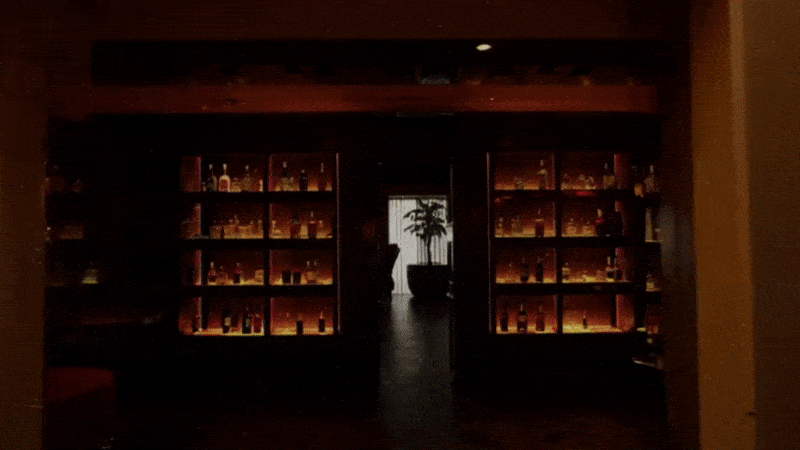
With the expanding nature of media, we see properties and titles that used to exist in one world begin to permeate and bleed into different forms and audiences. With more and more properties making the crossover, we now see how environments, spaces, and ideas that would exist within concepts like the 3D worlds of video games reach the mainstream in movie and television adaptations. Considering this, I began wondering what a real-world depiction of a business or brand would look like when taken out of the confines of the 3D world. Serena is just this, a representation of a high-end whiskey lounge in the fictional neighborhood of Kamurocho in Tokyo Japan. Utilizing elements from the source material to decide on art direction I create a proof of concept that blends the fictional world created by Ryu Ga Gotoku Studios with the real-world deliverables and concepts of a fully realized branding project.
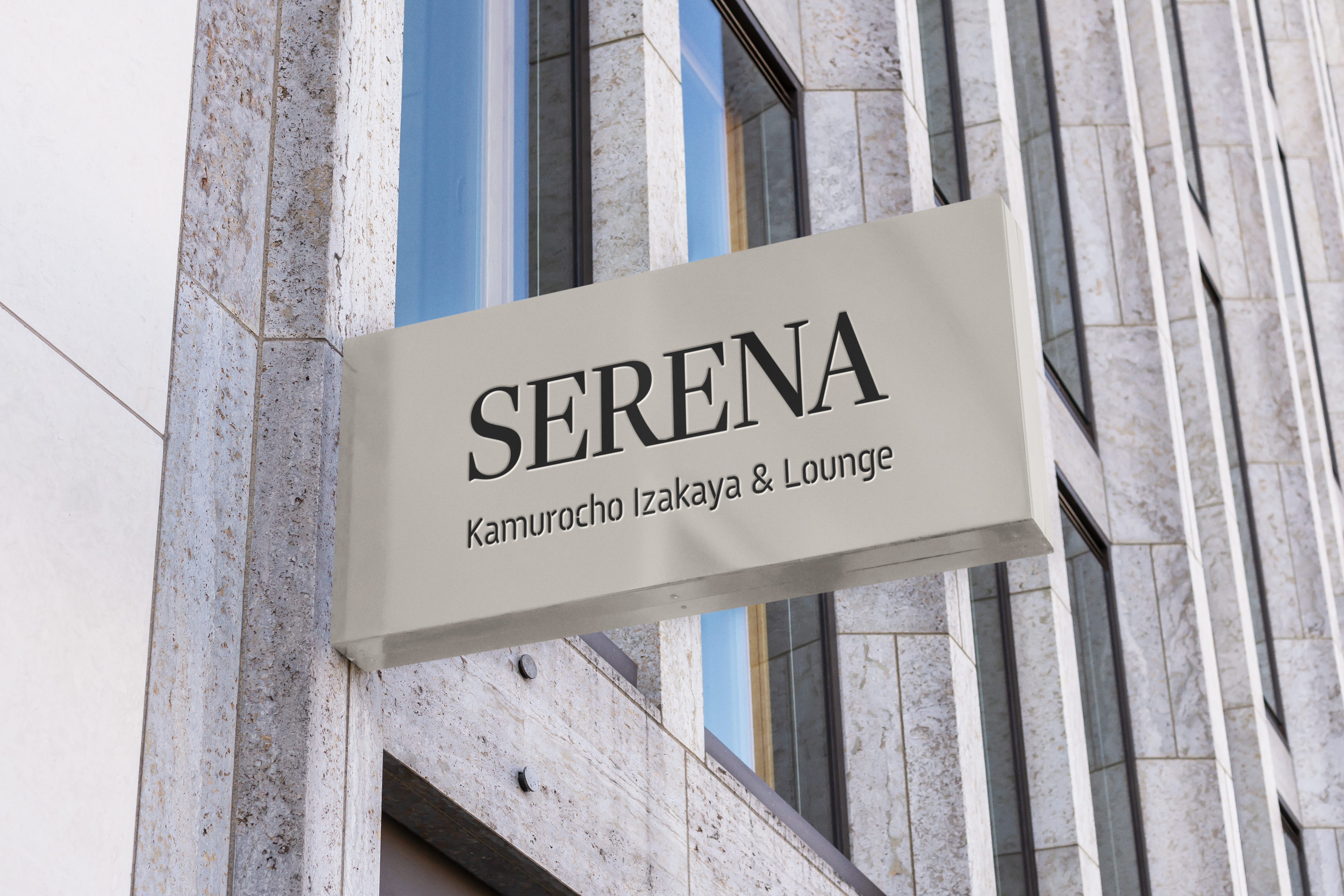
Exterior Sinage
![]()
Taking the Like a Dragon series as a jumping point, many of the decisions for aesthetics and content were laid out and instead of starting from zero, it became more of an adaptation and re-imagining of an existing brand. When approached from this perspective, the added elements of not fully removing the original essence of the project but in turn enhancing it became the goal.
Elevator Access Branding
![]()
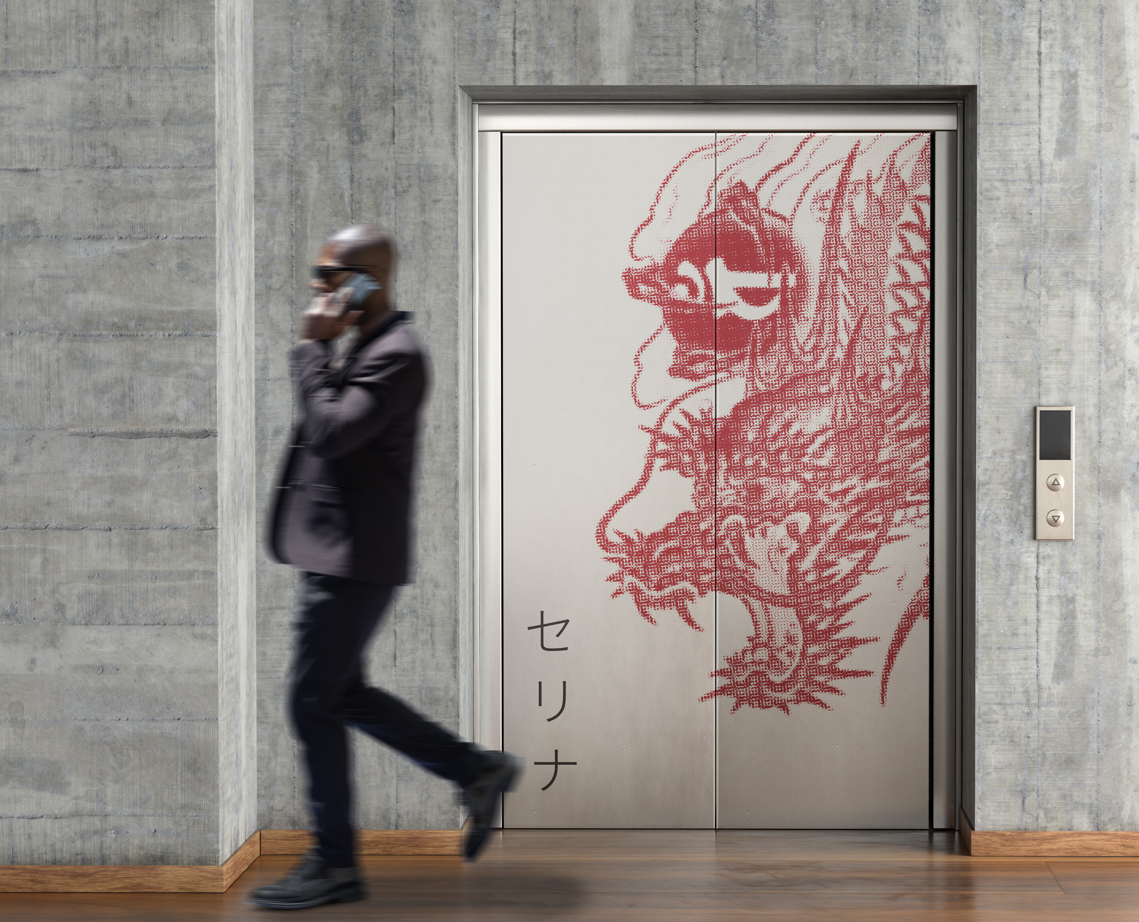
The in-world location of the lounge informed the paths and access that people would take. An elevator was a key element of this path so creating a recognizable impact was important. This same elevator motif would also inform the beginning animation of the video advertisement and shows the way the text initially reveals the motion of elevator doors opening.
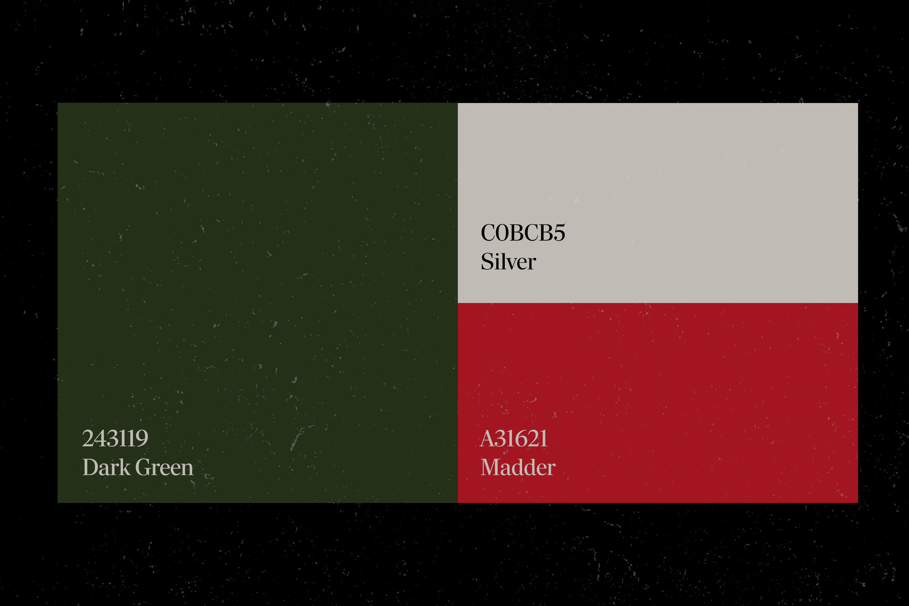
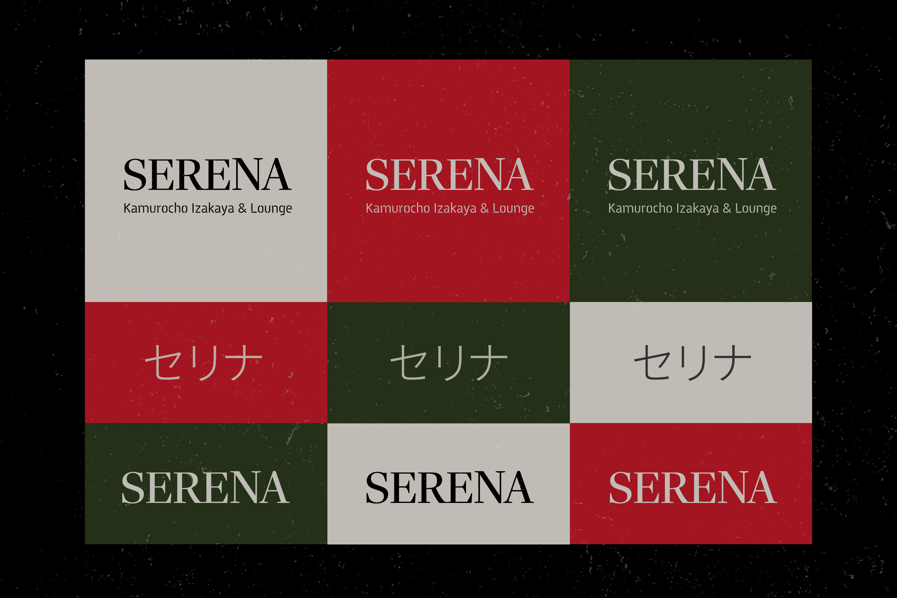
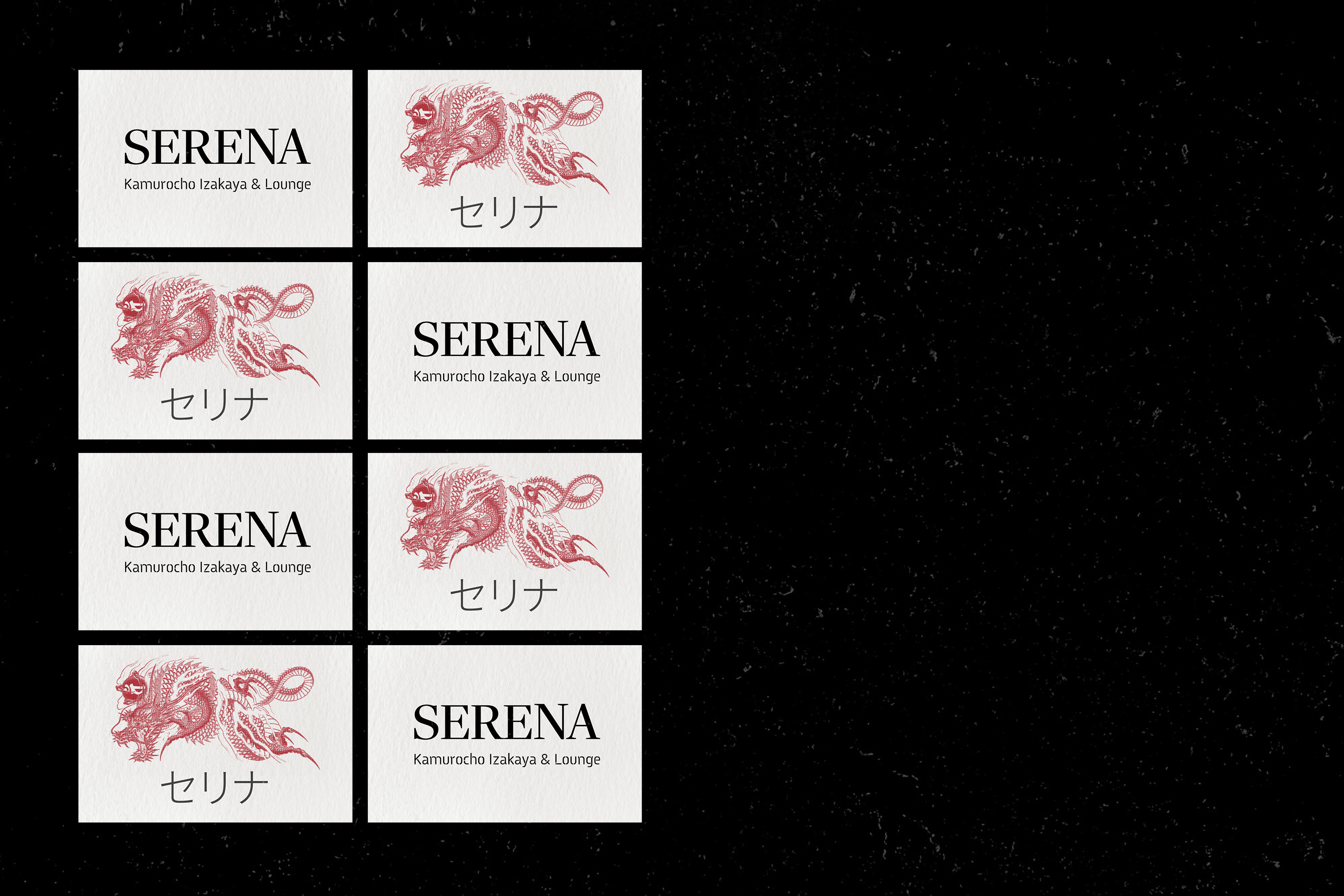
Color Palette
![]()
Type Interactions with Color
![]()
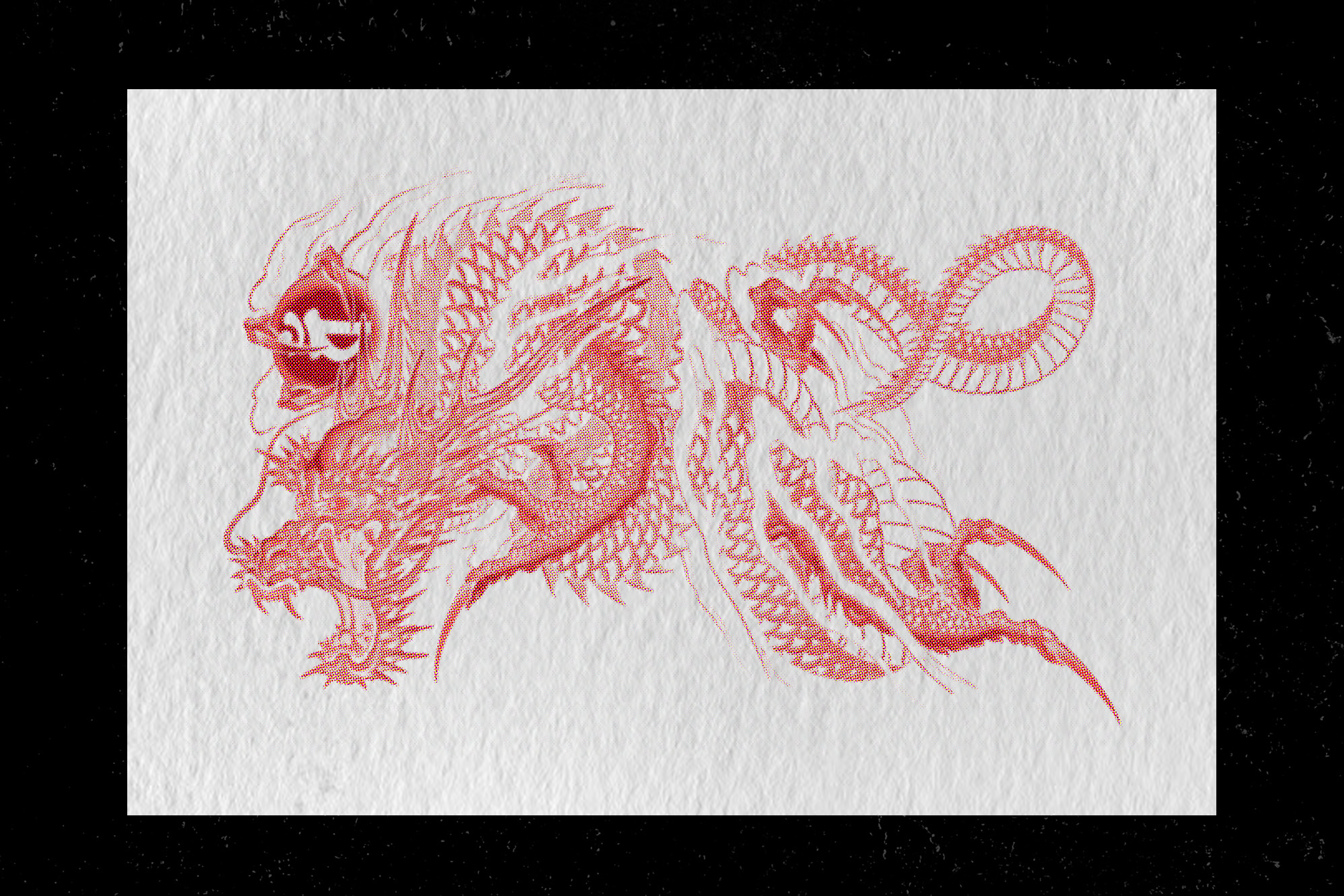
Dragon Stamp Abstraction from Referenced Media
![]()
![]()
![]()


Menu Design and Contents
![]()

Abstracting the dragon motif from the reference media and re-applying it as a red ink stamp that dances along the different elements provides not just an element of fantasy and whimsy, but at the same time a real world reference to cultural ements and recognizability of the brand at first glance.

When it came to the design of the menu, it was imperative to blend not just the concepts of the fictional world, but the environment of Tokyo that shapes this place. With that, the importance of including HIragana, Katakana, and Kanji was essential and appropriately type setting these elements. The blend of English for a wider reach was imperative, but also to highlight the way that many of the referenced material and names are taken straight from the English language and blended with the Japanese terms like with most Katakana in media and business today.
Coaster Variation and Branding
![]()

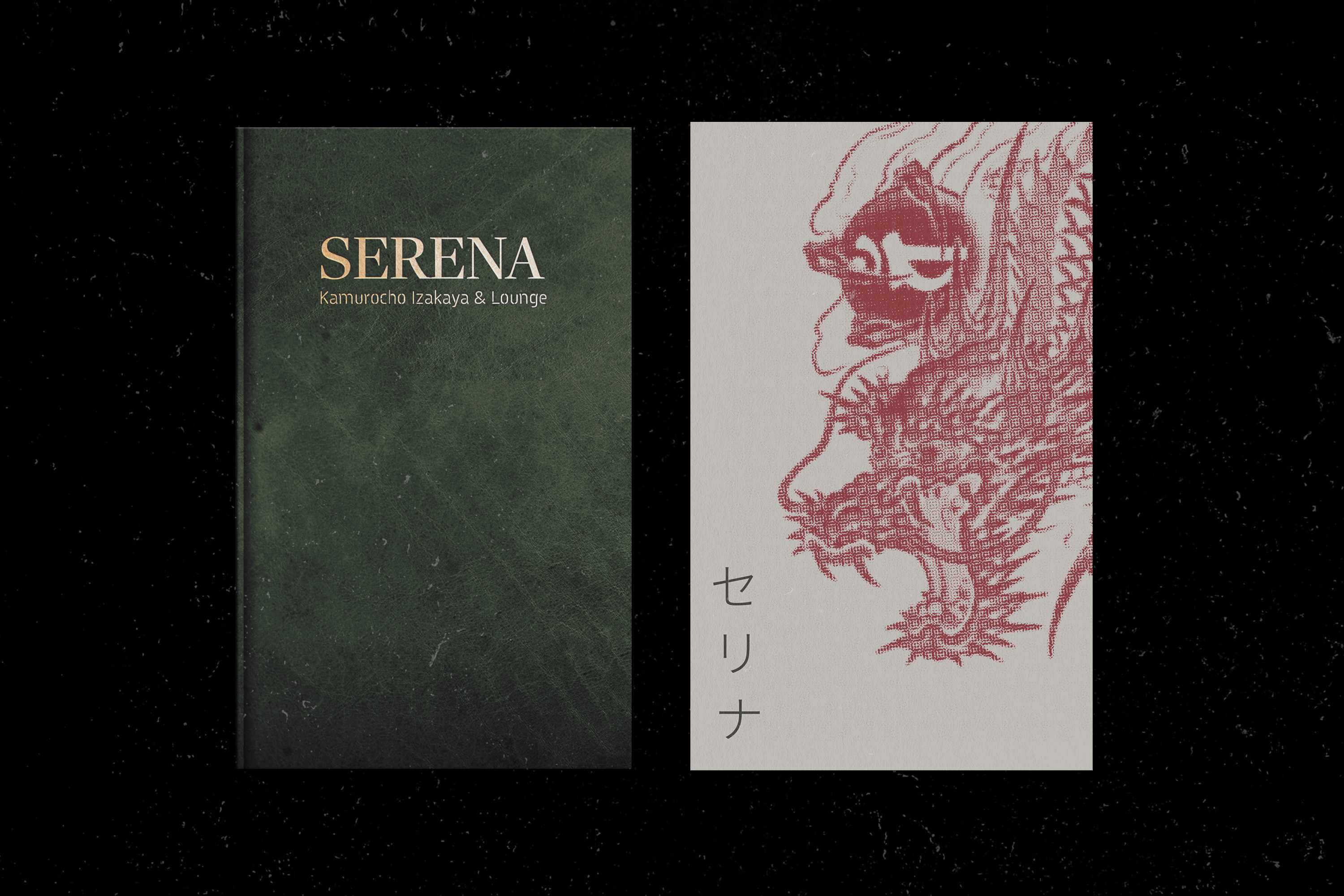
Business Card
![]()
Vertical Reels and Socials Adaptation of Content
![]()

Logo Implementation in Uniforms
![]()

Even the small details that can compose of the stitching and uniform design for employees are informed by the importance of staff dedicaiton and ideals when tied to a brand with history and traditions as deeply rooted as most Japanese establishments.